GA Email dashboard
We’ve been using Campaign Monitor for years for all our email campaign management (It is great!).
Anyway they created a email marketing Google Analytics dashboard.
An overview of the dashboard
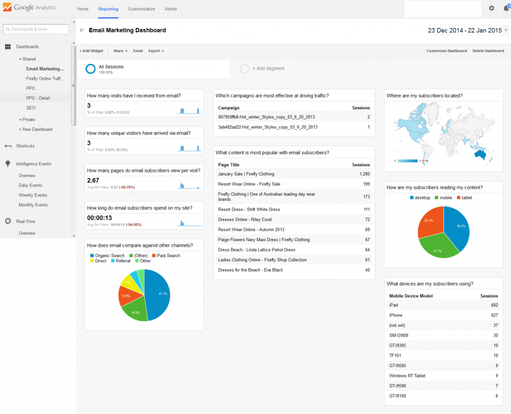
As you can see from the screenshot, the dashboard has been organized into 3 distinct columns, each of which help you answer a particular set of questions about your email marketing efforts.
The first column features metrics on how well email marketing is performing for your organization, and helps you answer questions like ‘How many visits have I received from email?’ and “How does email compare to other channels?”
The second column focuses on your campaigns and content, and helps you answer questions like “What email marketing campaigns have been the most effective at driving traffic?” and “What content has received the most visits from email subscribers?”.
The third column is designed to help you learn a little bit more about your audience, and helps you answer questions like “Where are my subscribers located?” and “What devices are my subscribers using?”.
The individual widgets
In total, there are 10 individual widgets in the dashboard that help you answer a specific question you might have about your email marketing.
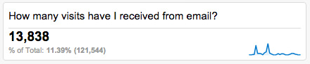
This widget shows you the total number of sessions (the new term for “visits”) that have come from your email marketing campaigns.
If you look closely, the widget also shows the contribution email makes to overall sessions and a trend line showing how visits from email has changed over time.
You can use this widget to report on exactly how much traffic email is driving to your website, and how this is improving or declining over time.
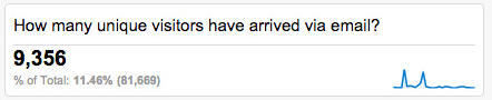
This widget shows you the total number of users (the new term for “Visitors”) that have come from your email marketing campaigns.
Again, the widget also shows the contribution email makes to total users and a trend line showing how the number of users driven through email has changed over time.
You can use this widget to report on how many unique individuals are engaging with your email campaigns and clicking-through to their website.
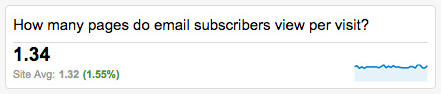
This widget shows you the average number of pages users who come from your email campaigns view in a single visit.
The widget also shows a comparison against the site average (from all channels) and a trend line showing how pages per visit has changed over time.
You can use this widget to report on the engagement of people who come from email, and help show the value of email beyond just pure traffic numbers.
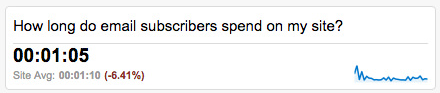
This widget shows you the average time users who come from your email campaigns spend on your site.
The widget also shows a comparison against the site average (from all channels) and a trend line showing how time on site has changed over time.
Combined with the pages per visit widget, you can use this to report on the engagement of people who come from email and show its value in creating highly-engaged visitors.
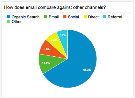
This widget shows how email compares to other channels in terms of driving traffic to your website.
If you hover your mouse over each segment of the pie chart, you’ll see the raw data and percentages behind the chart and a get a good understanding of how important email marketing is for you in the grand scheme of things.
You can use the data in this widget to show your boss or your clients the importance of email marketing in their overall marketing strategy, and help drive further buy-in and larger budgets to do more with email marketing.
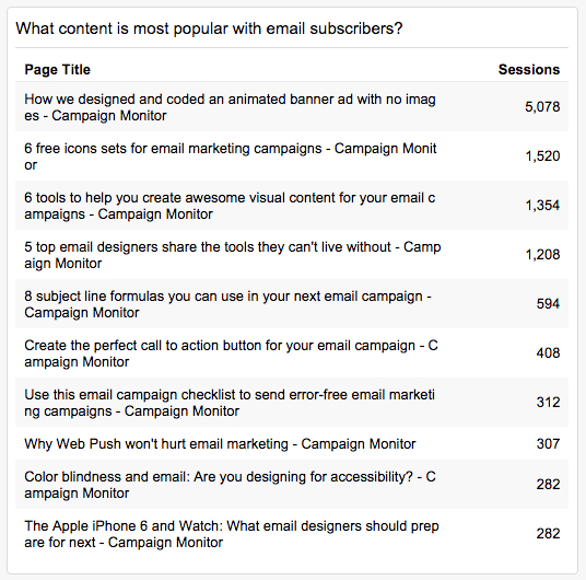
This widget the different pages of your website that people have landed on from your email campaigns, ranked by the number of sessions.
This information can be particularly useful if your campaigns contain links to multiple pieces of content (like our email newsletter does for instance), and can help you see what type of content is of most interest to your subscribers.
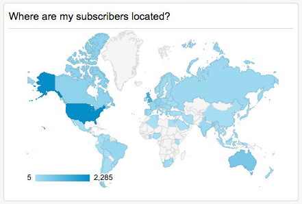
This widget shows you where the people who have arrived at your website from your email campaigns are located and gives you a good idea of the global distribution of your subscribers.
The map is interactive, and if you hover over a particular country it will show you the number of unique users who have come to your site via an email campaign from that particular country.
You can use this to get an idea of where your subscribers are located, and you can experiment with varying your send times or even dynamically changing content to ensure you are reaching your subscribers with the right message at the right time.
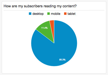
This widget shows you the environment (desktop, mobile or tablet) people who have arrived at your website from email campaigns are using.
The pie graph is interactive, and if you hover over a particular segment it’ll reveal the total number of sessions from that environment and the percentage contribution that environment makes to total sessions.
Whilst the widget only shows those who are clicking-through to your website from your email campaigns, you can use this to get an idea of what environment your subscribers are consuming your content in and ensure your email campaigns are optimized for those environments.
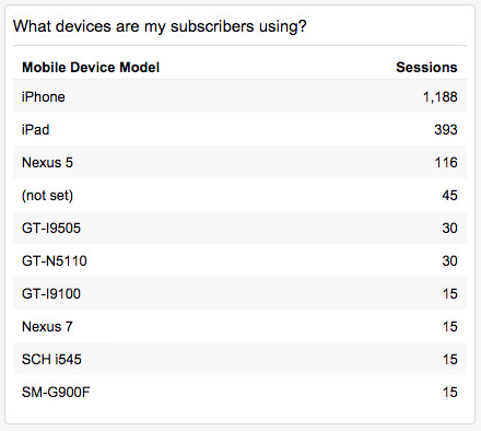
This widget shows you the types of mobile and tablet devices people who have arrived at your website from email campaigns are using.
Whilst the widget only shows those who are clicking-through to your website from your email campaigns, you can use it to get an idea of the devices on which your subscribers are consuming your content and make sure you are testing your campaigns across the devices your subscribers use most.
Non Campaign Monitor customers
For those of you who aren’t Campaign Monitor customers, all widgets are configured to only include traffic being tagged with the medium “email” so you’ll either need to manually tag your links or work out how to setup campaign tracking in your current email marketing software.
Further Customizing your Email Analytics Dashboard
Not everybody has advanced Google Analytics functionality like Goals and eCommerce tracking setup, so the dashboard is kept simple.
However, if you have these advanced functions in place then you can get a lot more sophisticated with tracking your email marketing.
Here are a few ideas:
- Track conversions
- Track conversions vs other channels
- Track conversions for each campaign
Closing argument..
Email marketing is one of the strongest customer retention tools and should be used regularly to maintain your “Top of Mind” status. This tool from Campaign Monitor is a great piece of work.