Forms are an integral part of virtually every website and often the first way a customer will make contact. A simple contact us form which proves complex to use, leaves the user unsure of the next step or is simply broken provides a terrible first impression.
Our top tips for a great form…
Think about the first impressions
When a visitor sees a form needs to be completed the first thought will be how long is it going to take to complete and whether the return is worth the effort. Assuming the visitor continues, immediately they will be wondering how their information will be used and how they are going to avoid a wave of emails, text messages and telephone calls.
Start by giving all forms a title and a simple explanation of what will happen once they complete the form.
For example:
Contact Us – We will respond via email within 2 working days.
Request Free Quotation – We will analyze the information provided and respond via email within 4 working days.
Magazine Subscription Order – We will confirm payment and when to expect your first magazine shortly.
And then assure your visitor you will not share their information and let them know exactly how you will use it.
Example: Data provided is solely used for the purposes of accepting payment and arranging delivery of your order.
Keep it simple
Assume that if someone is buying online they are doing so because they are short of time, so the simpler you can keep the form the better. It’s simple, if the form is lengthy and complex the visitor is less likely to complete the form and you will lose the submission. Keep form instructions to the absolute minimum as people tend to not read them and they clutter up the form. A well developed form shouldn’t need lengthy instructions.
You can never do too much testing, but just because it works from a technical angle it doesn’t mean the form is easy to use. Before you put a form live make sure a range of people have tried out the form. For example, if your target market is the over 65’s then you need to get some feedback from some over 65’s!
Other elements:
- Be flexible on how data is entered – allow data to have spaces, dashes etc. The more rigid you are in the format the more frustrating it can be to the user. Show an example of the data you expect to see.
- Clearly label every field – make it crystal clear to the visitor exactly what information you need.
- Keep the font size legible – it’s tempting to make the font size smaller on each field, but don’t. Visitors need to be able to quickly and easily read the fields.
- Pre-filled content – if you already hold information from a previous order or from the device they are using, then pre-populate the form as appropriate. Always give the option to change the pre-populated information and never pre-populate sensitive data such as credit card information.
- Provide options to select from – selection boxes, drop downs and radio buttons are great ways to have simple to process, standard information provided and from a user perspective it means they can quickly click on the correct answer. Always provide a free format box so that visitors have somewhere to input their data if none of the options apply.
- Keep the design simple – for check boxes and radio buttons. It’s more important they work and visitors can easily click on them than them looking pretty.
- Only show the relevant parts of the form, so if there are options which result in more fields then only show those fields. This is particularly relevant when it is a very large form.
- Don’t forget mobile – make sure fields, drop downs etc are big enough to be clicked on from a mobile phone. Make sure your testing includes tablets too. Apple recommends a minimum of 44px by 44px space for buttons to match a typical finger size.
- Mark the essential fields with an asterisk. Ideally in a different color to the text.
- Allow tabbing between fields – it’s a quick way to move round a form.
- Progress indicator – this has become increasingly popular and you now find this on both simple and complex forms. It gives people a great perspective on how much more they need to complete and means they are far more likely to continue. Make sure it is easy for users to go backwards and forwards in the form so they can make corrections and see what’s coming.
- Action buttons – avoid using terms such as “Click Here” or “Submit” and instead state what actions the button will do when it is clicked. Examples are “Create my account” or “Place my order”. It all helps with making it easy for visitors to understand.
Help visitors fix their errors
We’ve all been there, you quickly want to order something but you can’t work out what’s wrong on the form. It’s very annoying. A well developed form shows you very clearly the field with the error, a simple and polite message on how to make the correction and never deletes all the previously entered data.
An effective way of showing help on screen is to put the help text in a box and show it to the right of the form. If you are limited on space then look at using tool tips and then if a lot of information needs to be provided popup a new window.
Complete the form
Once the user has submitted the form, communication now changes. Firstly, display the form with all the completed information so the visitor can make one last check before completing. Then confirm submission and explain what will happen next. An email confirming the same information is now a standard part of a form process.
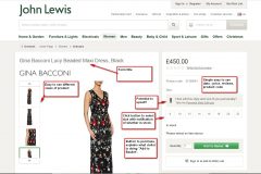
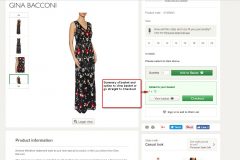
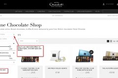
Some example clever forms are shown below.


